BI & Reporting Dashboards
The process of gathering requirements and designing dashboards to make real-time data useful and actionable.

Customer Delivery Projects: BI & Reporting for various clients
My Role: UX Designer & Business Analyst
objective
Design BI & Reporting dashboards for various enterprise clients in order to give insight into metrics per the organization’s needs. Providing visibility into their workforce to make data-driven, proactive actions to reduce help-desk tickets, and improve the end-user cloud workspace experience.
CLoud Metrics

Examples of work

AWS WorkSpace Metrics for a health insurance company
Ability to drill down to specific WorkSpace region and WorkSpace ID
Ability to select specific time range up to last 30 days
Overview of entire fleet connected: Connection status, Healthy vs. Unhealthy WorkSpaces, and In Session Latency
Clickable links for WorkSpaces showing Unhealthy status or High Latency
Ability to set alarm for specific In Session Latency threshold
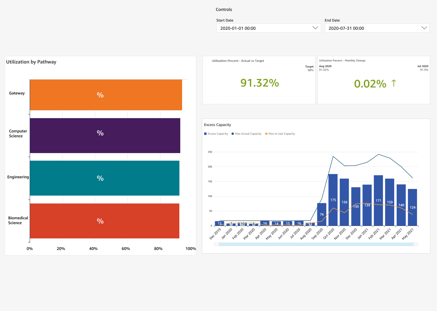
AppStream Metrics for EdTech Curriculum and Service Providerd
Administrator overview of schools usage metrics
Utilization percentage by specific “pathway” (course)
Target utilization compared to Actual Utilization (amount of hours used vs remaining)
Chart showing Excess Capacity and Max Capacity over time (how many images available vs what’s in use)
Ability to change the date range to specified date
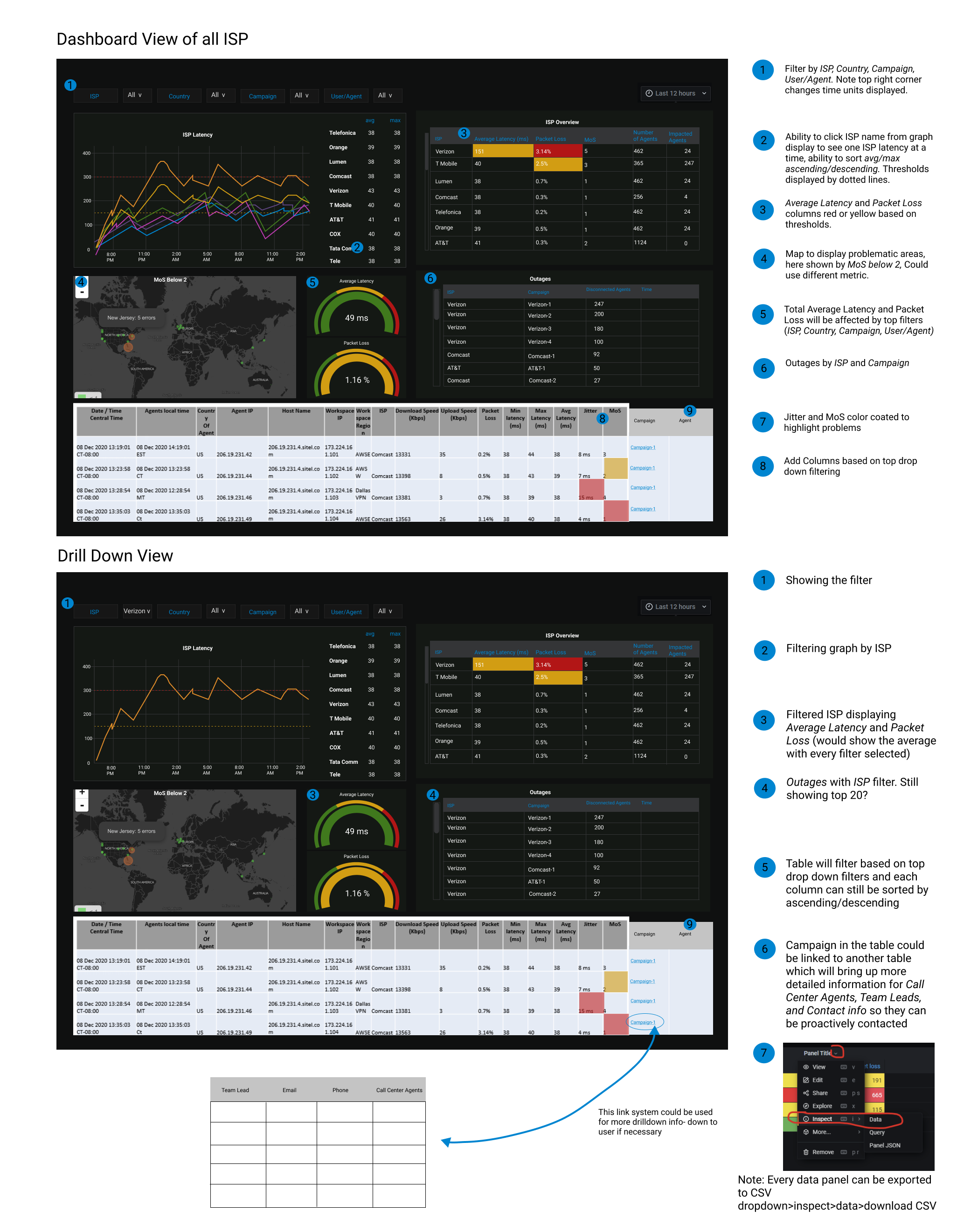
Agent Call Center

Brainstorming solutions
Final solution
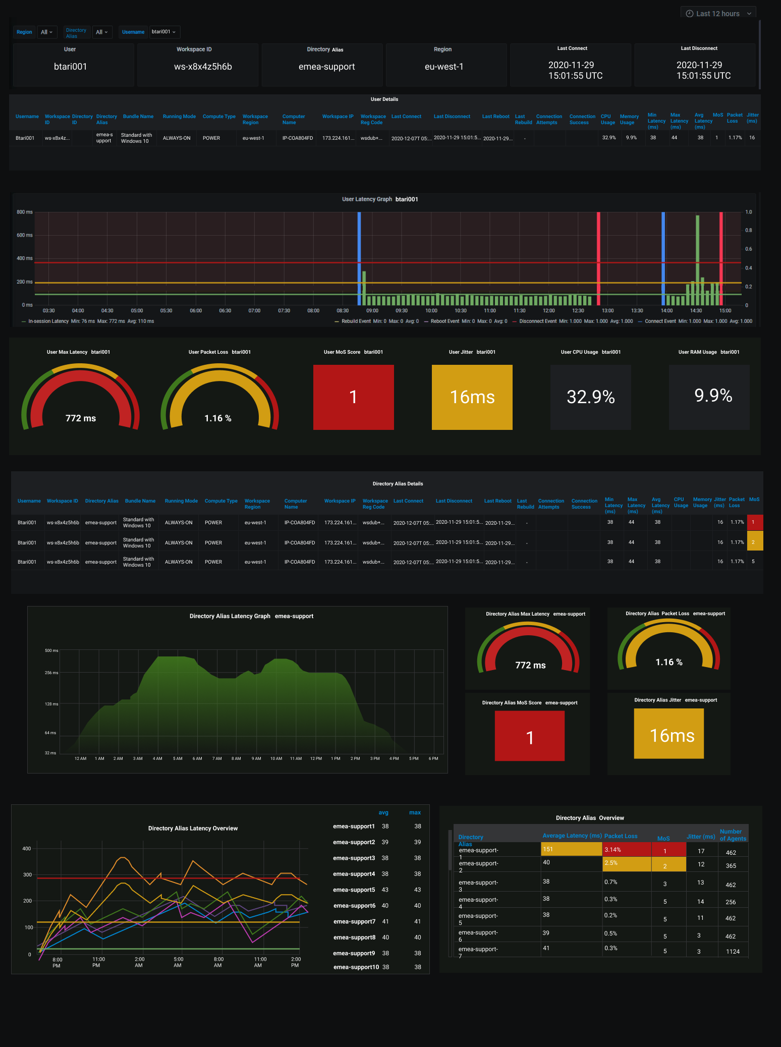

Call Agent Performance Dashboard - First Line of Support
Ability to filter down by Region, Directory, and User
Ability to see Latency, Packet Loss, MoS score, CPU & RAM by above filters
Overview of Network Metrics by Directory with a table displaying most affected agents first
Visualization into Network Metrics by ISP (internet service provider) in order to see large outages
Time control filters